Data Visualization in Virtual Reality — A VR Demo Project
The project, Night at the Museum, is the final project of an online course that I’ve subscribed to for VR. It required us to do research on a VR company/technology, or an industry that could be impacted by VR. After conducting research, we had to create a mobile virtual reality experience that displayed our findings in an interesting way to users. Suggestions for scenes included a museum, science fair, or gallery-like space to showcase findings.
I’ve been very interested in Data Visualization for a while and think VR is a cool medium for us to interact with Big Data and visualize it in an entertaining way. I decided to do my research on the VR/Data Viz industry and come up with some cool scenes that show how data can be and is being visualized in VR. You can check out the full project on github.
(This project used Unity 2017.1.0p4 and GVR Unity SDK v1.70.0)
Night at the Museum: A Data Tree:
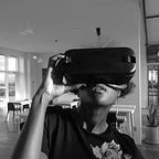
Take a look at the Unity gameplay video below!
The Process
Who is this for?
This project is great for anyone interested in seeing what VR has to offer — and particularly interesting to lovers of data and/or research! Even if you’re not in the Data field, I think the scenes are generally entertaining, enlightening and educational.
The Making of:
I first looked into different companies doing Data Visualization in VR. Whilst only a few companies, such as Virtualitics, are primarily doing Virtual Reality Programming for Data Visualization, there are several companies such as the Wall Street Journal and Google that have used VR to visualize their data! This one by the Wall Street Journal is one of my favorites:
21 years of the Nasdaq: The width of the path reflects the index’s price/earnings ratio, with a narrower path reflecting higher share prices relative to earnings.

When I started out, I stuck with a space theme because space reminds me of data…and I had a bunch of space prefabs downloaded from a previous project. It made sense right? For my main, central scene, I experimented for the first time with Unity’s Tree Maker and built a tree in the middle of space. I learnt a new skill and also had my own little pun (Data Tree…Data Structures…Get it? This might be a me thing).
The Data Tree became home base with scenes attached to different branches. I created 5 scenes: 1) Companies doing VR Data Viz 2) Interact with a 3D graph 3) Watch and Play a Music Visualization 4) A Timeline of Women in Science 5) Explore a 3D network graph.
The project took me a week to complete. That said, I spent a lot of hours that week working on this — about 50 hours in total. The most time consuming part was figuring out how to script different things that I’d never done before. Scenes like the Music Visualization and a moving 3D node graph were the hardest but I borrowed scripts from asset store that taught me a lot (Thanks Audio Visualizer by Dog eat Dogs and 3D Network Graph scripting by Eric Mourin!)
No Sketches — Eek!
I usually create sketches of my scenes before I make them but the process behind this project didn’t allow that. As much as I love Data Viz, I had no idea where to begin with it and how I was going to make each scene until I’d actually started (this is how the Data Tree came to exist — I was just playing around with Unity objects and wanted to try making a tree). The only scene I had a semblence of an idea about before starting was The Timeline of Women in Science. I had seen the Wall Street Journal Roller Coaster above and knew I wanted to make something similar to it.
User Testing
My user tests went generally very well. Users really liked the Data in Space theme and most were super excited to see different ways that you can use VR! I had one user tell me that I should make a Movie in VR that used Data as it’s main narrative structure — not a bad idea huh?! Users said that they liked the background music of each scene and it felt appropriate.
One user, My Reviewer, went as far as saying that the project was one of the best submitted so far!
Constructive criticism regarded some of the scripting such as allowing users to return to the last waypoint when returning to the Data Tree instead of reloading the whole scene again from the beginning. I got feedback on some issues on scale and positioning of waypoints which were easy to fix. I also had to adjust some of my colors and lighting since the general aesthetic of the Demo is quite dark. I added lots of particles to objects such as waypoints that kept with the data/space theme but added some brightness.
Breakdown of Final Piece:
The final piece is a series of Demo scenes focused on letting users understand some of the ways that Data Visualization can be done in VR. The scene opens on my Data Tree (main scene) and users are instructed to Navigate the tree using shiny blue way points that look both like data points and stars.


A fun effect on the Data Tree is a windzone that ruffles the branches and leaves and rotates the scene canvases. It adds a little bit of an eerie effect (my reviewer said that it creeped him out — oops!)
Companies in DataViz/VR
This first scene is relatively simple and includes three videos about companies doing cool things in VR. The three companies are Virtualitics, Nirvinq Labs and Looker. I used the companies’ YouTube pitch videos for the scene. Users click on a screen and watch the videos. If they look away from the screen, the video pauses.


Explore a 3D Network Graph!
The second scene is called ‘Explore a 3D Network Graph!’. Users find themselves inside a 3D network graph, where each node is also a waypoint. Users can navigate from Node to Node to explore the graph. There’s also a moving node that leaves a trail behind it, creating different paths. Whilst the movement is random, it’s a great way to demonstrate cool ways to draw network paths in VR. The user also has the option of moving with the Moving Node around the graph. It’s pretty fun but because the node moves quite fast and there are a lot of directional changes, I made it such that movement stops after 30seconds so that the User does not get motion sickness! I definitely had a lot of fun coming up with this scene!


Create your own 3D Scatter Graph!
This scene was simpler than the others. The part I had to figure out was how to come up with a drag-objects script but was able to do this reasonably quickly by going through the Unity forums. The scene has a 3D graph (with no labeled axis) and 6 different sized Data Spheres. Users can navigate around the graph and move the spheres to where it made sense for the graph they had in mind. The idea was to emphasize how we can actually interact with data and to show how multidimensional we can view data. Not only can you use the three axis (X, Y, Z) you can also use shape and size to differentiate data points!


A Music Visualization
Visualizing rhythm isn’t new but visualizing it in VR — now that’s cool! I see this as a different type of Data Viz experiment since music can be data but what excited me the most about it is literally just how fun it is! Users can click on different instruments that enhance a beat and see how the the sounds are visualized either individually or through different combinations!


A Timeline of Women in Science
This scene is my personal favorite! I’m most proud of it because I created all the objects and scripts from scratch. The scene borrowed from an idea I saw on the Wall Street Journal (above!). I wanted to highlight different women in science and show the rate at which women are participating in science. The scene is a mini (and slow) roller coaster in space. Users start the journey in a space ship moving flat along the tracks. The ship makes different stops along it’s route where users can click on an image of a Woman in Science and read about her and her work. On the left side of the tracks is the year. And on the right side of the tracks you see the percentage of STEM professionals that are women. As the percentage increases, so does the incline.


Conclusion
I had a lot of fun working on these scenes and learning the various ways in which Data can be explored and understood in VR. It’s definitely the most advanced VR content that I’ve created and I learned a ton about how to make this stuff happen! I’m going to continue working on this project because there are still a bunch of things I want to fix and expand on. For one, I’d like to improve the create your own graph scene to include different data shape points, axis and legend options and audio feedback based on certain graphs to let users hear the implications of their graph in numbers. I’d also like to make the Timeline of Women in science more like a roller coaster — with turns, different speeds, audio feedback and a narrative that feels a little more exciting.
Overall though, it’s been a great learning experience. I hope that a wide group of people can find this interesting from data lovers to artists, to people in education and advocacy and people who are just interested in cool new ways to tell narratives. The project has definitely sparked a lot of ideas for me so stay tuned for future projects!